The Claude-ification of design
Topic:
Craft
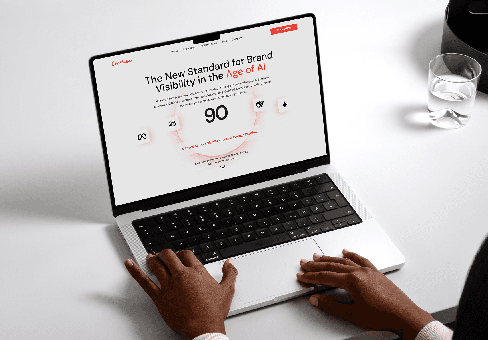
You have seen it even if you never named it. A tracked-out, all-caps eyebrow sitting above every section. A neat sans on an off-white background, one accent color, generous whitespace, a soft gradient orb glowing somewhere in a corner. It is tidy, it is safe, and it is everywhere. This is what competent design looks like once the floor has been raised and the ceiling has not moved.
None of this is bad on its own. A raised floor is a genuine gift. People who could never afford a studio can now ship something that reads as considered, and that deserves to be taken seriously rather than sneered at. The problem is not that the work is ugly. The problem is that it is identical.
The tells
The giveaways are consistent enough to list, which is the whole point.
All-caps labels, letter-spaced wide, used as eyebrows above every heading whether the section needs one or not.
The same three-tone palette: near-white, near-black, and a single confident accent that never quite earns its place.
A centered hero, one balanced line of text, a pill button, and a faint gradient blur doing all of the emotional work.
Copy that hedges in the same cadence, because it was drafted by the same model in the same tone.
Why sameness reads as risk
For a while, looking AI-made signalled being current. That has quietly flipped. When a landing page wears the house style too cleanly, a certain kind of visitor now pauses. Not because the design is wrong, but because it is a costume anyone can rent. The polish that used to imply care now implies that no particular person made a particular decision here.
This matters most where trust is the product. A payments tool, a health service, a company asking for a card number all benefit from looking like someone specific stood behind them. The generic template says the opposite. It says the fastest possible route was taken to appear legitimate, which is exactly the shape a low-effort or fraudulent product also takes. Sameness has become an untrustworthiness signal.
What still separates the work
The escape is not more novelty for its own sake. It is the return of judgment. A specific choice a model would have averaged away. A real photograph instead of a stock gradient. A voice that sounds like a human wrote it on a particular Tuesday. Friction that was kept on purpose.
AI made the road to decent design shorter, and that is a good thing. But decent is now the baseline, not the destination. The studios that matter will treat the house style as the starting line everyone shares, then spend their effort on the part that never templated well: knowing what this business, for this person, actually needs to say.
T


Insights
Have a project like this in mind?
Tell us what you’re building. We reply to every serious inquiry within two business days.